Before and After: A Case Study

CLICK ABOVE TO VIEW FULL IMAGE
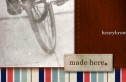
As with most clients, we were faced with a bit of a dilemma on this project. Our goal was to freshen up the design of a catalog cover for a publication published quarterly. Since our job was to redesign the cover only, we had to keep many elements intact, so as not to jar viewers who had seen previous catalogs, or confuse them when they continued to peruse the current catalog. Behold, the original cover design (left) and our design (right).


What We Were Working With
As you can see, we started with a fairly generic template we were given. We had several catalog items we had to include, but had a little artistic license. Among our favorite design elements was the amazing starbust. Obviously, the logo and its position and size needed to stay pretty consistant.
Our Plan
We noticed immediately that there was no heirarchy to the old design. Everything was the same size, same weight, same intensity. On a catalog, the viewer will get distracted, and each element makes the cover look too busy.
- Job one was to use a large image the bring viewers into the catalog, and establish the tone for the guide.
- Next, we needed to choose a traditional looking font that would warmly portray the holidays, and the classy-looking equine feel. Trajan Pro was our choice.
- The colors needed some adjustment. The green was nice, very rich. The red, however, looked almost pink and garish. We chose more of a burgundy.
- We added pinstripes in the background to add a touch of class.
- We got rid of as much of the starbust as we were allowed.
- We adjusted the positioning of the items to look a little less cluttered. By bleeding some of them off the page, viewers get less distracted by the lack of grid. Similarly, the old design had a lot of trapped white space, leaving holes in the design.
- We added a photo to the photo frame. Who wants to look at an empty photo frame?
- We balanced the weight of the page. The top is heavy with the large photo, so we confined our other objects to a smaller quadrant. We also attempted to keep a good text/photo ratio.
Behold, the new cover.


jparm1 September 19, 2006 Clients, Tips and Tricks