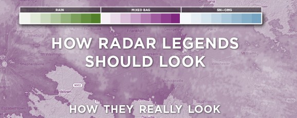
Redesigning Weather
CLICK ABOVE TO VIEW FULL IMAGE
When most of us think of design, we think of advertising or some type of media. We think of billboards, magazines, posters and wedding invitations. Things created by designers to look pretty and promote something.
But, sometimes we forget that at its purest level, design is used as a utility to help people better understand information and ideas.
Road signs, dashboards, microwave buttons and thermostats are all items known more for function than form, but the artistry behind them, while not a priceless Picasso, is every bit as important.
Good design that serves more for function, often goes unnoticed as “design.” And, we tend to overlook the visual appeal of it, and accept it as status quo. It’s not until that utilitarian design degrades in function (legibility, identifiability, etc.) that we begin to see flaws in it. And even then, we are pretty forgiving.
We did a post not too long ago discussing a re-concepted design of the NCAA tournament brackets. When bracketology took to web and mobile devices, Hyperakt echoed everyone’s sentiments that the traditional single-elimination bracket was far too clunky to work with modern browsing devices. So, they took it upon themselves to re-imagine how the brackets could work for today, and they proposed a beautiful circular model, which hopefully catches on.
During the impending winter storm of late, I noticed (for the umpteenth time) how difficult the legend can be on radar maps. The lighter colors for frozen and mixed precipitation are nearly the same, and heavy frozen is virtually indistinguishable between mixed light and mixed heavy, as you can see below.
I realized that it was just a design flaw that I had just accepted as probably the best it can be.
So, I decided to do a quick redesign.
In my mind, heavier precipitation should mean darker, more saturated color. Thus, lighter purple would mean lighter wintry mix. Darker blue would mean heavier frozen precipitation.
And with the color hues being close in shade, a purplish blue would indicate a blend in mixed and frozen precipitation. Makes sense to me.
What are some other interfaces or utilitarian designs that could use some freshening?


jparm1 March 6, 2013 Blog, Inklings